Skip to content
 

Turbo-Chart 

WHAT IS

Turbo-Chart?

Turbo-Chart is a desktop application, to effortlessly generate Time-Location charts in minutes utilizing your current project schedule data.

Unlike alternatives like Tilos or Excel generated charts, Turbo-Chart integrates with your preferred scheduling tools such as:

  • Primavera P6,
  • MS Project,
  • Asta PowerProject,
  • Safran, and
  • More, using our easy Copy and Paste Wizard
What are

Time Location Charts

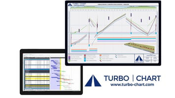
Time Location Charts are an alternative form of representing project schedules suited to linear projects where work progresses in a repetitive manner and/or in a continuous linear-direction over the project’s physical location and also where works occur in fixed locations that interface with the linear works. Examples of linear projects include:

  • Highways
  • Railway
  • Tunnels, and
  • High-Rise Building Construction

Visit our FREE Time Location Charts Mini-Course 
Time Location Charts Mini Course
200706 NEWCOMPIMAGE
WHO IS

Using Turbo-Chart?


You no longer need complex expensive software, or error-prone manual drawing methods


Turbo-Chart enhances your existing scheduling capabilities, rather than compete against them, saving you valuable time, cost and effort, that can be spent improving your schedules! 

users-logo-08-1
users-logo-09-1
users-logo-10-1
users-logo-11
users-logo-12
users-logo-13
users-logo-14
users-logo-15
users-logo-16
users-logo-17
users-logo-18
users-logo-19
users-logo-20
users-logo-21
users-logo-22-1
users-logo-23
users-logo-24-1
users-logo-25
users-logo-26
users-logo-27-1
WHAT ARE

Turbo-Chart users saying?

Hear customer testimonials on the benefits of using Turbo-Chart
Turbo-Chart

Features and Benefits

icon1

Integration

We make integration easy! Your existing scheduling tool (P6, MSP etc) remain the single source of truth.

icon 2

Data Re-sync

When you make changes to your schedule (in P6 , MSP etc), re-sync to instantly see the changes on your chart.


icon 3

Multiple Charts

Additional charts allow you show more than one view of the same data. E.g. you may show a summary of the overall road project and more detailed charts of bridges/intersections.

icon 4

Multiple Datasets

DataSets allow you to easily compare scenarios on the same chart. E.g. Compare Planned vs Actual, or baseline vs P80 Risk Adjusted.

icon 5

Chart Orientation

Some charts work better laid out differently. E.g. Multi-story building are best with height on the Y axis, and time on the X, but linear projects like railways, tunnels and bridges are usually best with location as the X axis an time on the Y axis. Turbo-Chart lets you choose the orientation and direction of each axis.

icon 6

Shape Library

Choose between Line, Area, Parallelogram and Triangle basic shapes. Customise colours, fill styles and colours and opacity to create an unlimited number of shapes types. The legend is created automatically but is fully customisable. Filter Shapes displayed per chart.

icon 7

Annotations

Annotations are additional text and graphics placed anywhere on your chart. Even though we can help you generate a chart from schedule data in seconds, the best charts have additional information on them to keep everyone informed.

icon 8

Highlighters

As well as text and graphics, we can help you quickly highlight key dates and locations on your chart. Our highlighters can help readers see locations like bridges, stations or levels, or dates like contract milestones, weather periods or the data-date.

Latest Turbo-Chart News

Want to find out more about Turbo-Chart:

Book a call with us to:


  • Discuss how Turbo-Chart will help your project
  • Watch  a demonstration of Turbo-Chart
  • Get help understanding how to use Turbo-Chart
 

Additional Help

External Links