Gantt charts are the most common way of presenting a project schedule. They’re an important tool, but Gantt charts suffer from one fatal flaw: They are extremely difficult to read and comprehend.
This causes problems on a project because most people are not comprehending the full schedule. Teams are focusing on their part of the project and not looking at the bigger picture.
Luckily, there’s a way to get all of the information in a Gantt chart onto a single page. It’s called Time Location Charts. With this method, it’s possible to present 50, or even 100 pages of a Gantt chart onto a single page. Here’s our video showing how I got an 88-page Gantt chart onto one page. Or scroll down if you prefer to read.
Gantt Charts
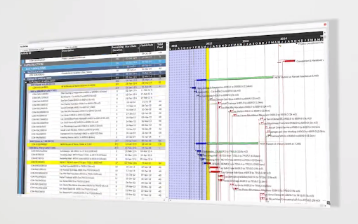
In traditional schedule analysis, we’re used to seeing this, a traditional Gantt chart, presented on the screen row after row, or printed out on page after page. These are boring and very difficult to sit through.
They’re actually quite abstract if we think about it, closer to lines of data in a database, definitely not a visually intuitive graphic.
The horizontal axis is time, and the vertical axis is some breakdown structure or grouping of the individual tasks. A key thing to note is that it’s one task or activity per row in this format, we only see the dates and some information about how the activities may be linked or connected to one another
Showing a Gantt Chart On One Page:
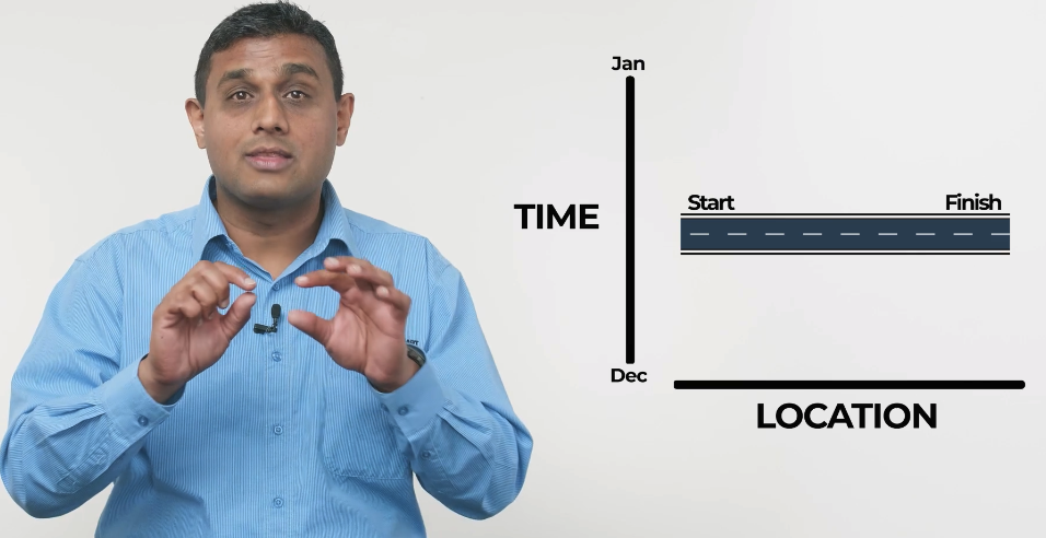
Now let’s try a slightly different format. We’ll keep one axis as time. But we’ll make the other axis a Linear Axis, representing the distance or locations that the project may go over. So if you think about a highway project, the time axis is the duration of the project, and the location axis represents the entire length of the roadway being built.
These could be represented as kilometers. Mileage or chainage is another term you may have heard used. You may also represent it by zones, area 1, area 2, area 3. Or for high rises, floor one, floor two, floor three.
Now we can start producing activities based on WHERE they are occurring as well as WHEN they are occurring, and this adds a whole new dimension to the schedule information being shown!
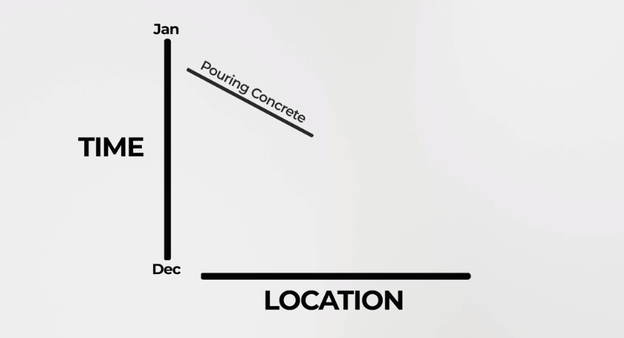
An activity is drawn representing a start date at one point and a finish date at another point. But we also introduce WHERE that particular activity is happening on the Linear axis. So we’ll have a start location value and an end location value, which could be kilometers along a roadway. For a highway project, we can see a task like pouring concrete progress as a line that runs from one end of the roadway to the other.
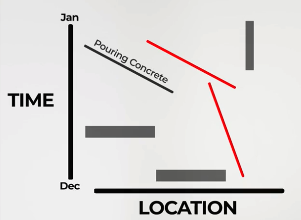
The direction of the line shows you the direction of the work from start to finish, and the gradient of the line shows you the speed of the work being done, with tasks that are the same speed making parallel lines.
If a task occupies a whole region on-site for a period of time, it is better shown as a shaded area on the chart, like a square or rectangle.
A project milestone that happens at a single point in time appears as a point on the chart.
Then, we can use colours to represent different types of work being done. For example, everything that’s purple is a drainage culvert, and everything that’s a green line is a run of pavement. We can even highlight certain tasks to show the critical path of a project.
Now we have a Time Location Chart.
Time Location Chart Examples
Let’s look at some examples of Time Location Charts on real projects.
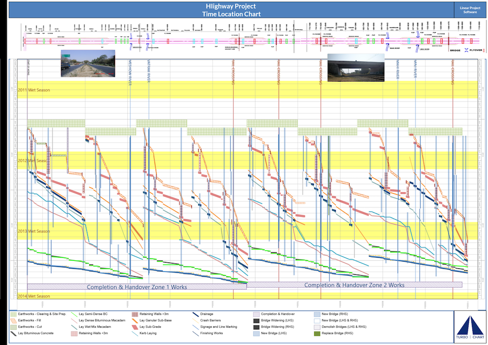
Highway Project
Here’s an example Time Location Chart for a highway project, with the critical path shown in red.
Vertical High Rise Project:
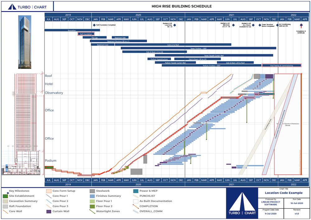
Here we’re looking at a high rise. In this case, the time is on the horizontal axis a bit like a traditional Gantt chart, the vertical axis represents the physical areas of the high rise building. A summary of the whole project being represented on one page. The red boxes are the critical path of the project.
Fibre-Optic Network:
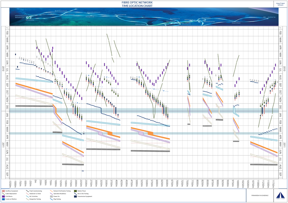
About 10 years after my first fibre-optic network I had the opportunity to work on a very similar project, thousands of kilometers of fiber optic rollout. This time I was armed with a lot more knowledge of how to present this type of information and how to generate charts. Another successful outcome here with thousands of kilometers and tasks presented on a single page.
Segmental Bridge:
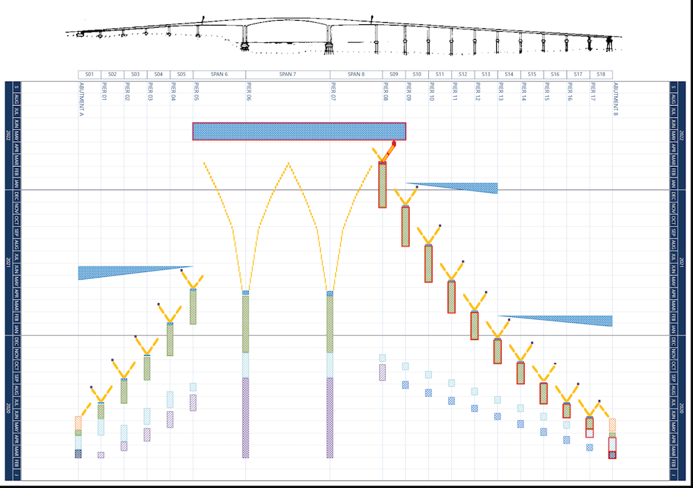
A simple example here of a bridge to show it’s not just the traditional highway/railway/tunnel type of projects these charts can be used on. Again, we can easily see the critical path on this project.
Why Use Time Location Charts?
The most incredible thing about Time Location Charts is they can replace many pages of a traditional Gantt chart with a single concise page.
Think about what that means. Rather than having 10, 50, 100 pages of printout of a Gantt chart you’re actually conveying the same information on one page.
In the examples above, we’re representing about hundreds or thousands of tasks that would traditionally have been 10-100 pages of Gantt chart and here it is on 1 single page.
Get the Full Video Course On Time Location Charts
If you want to get your Gantt charts onto one place, I’ve created a 30-minute video course that covers everything you need to know about Time Location Charts, including:
- What are Time Location Charts
- Why they are the best way to communicate a project schedule
- Who can benefit from Time Location Charts
- How to read Time Location Charts
- How to optimise a schedule using a Time Location Chart
- The best (and worst) ways to generate Time Location Charts
- A 90-second demo of how to create a Time Location Chart with Turbo-Chart
- Tips on getting your team on board with using Time Location Charts
If you find it helpful, feel free to share it and send it along to anyone that can benefit. And, contact me with any questions about Time Location Charts and Turbo-Chart!

